Sushi Yeoubi
Brand Identity & Brand Style Guide
Sushi Yeoubi is a family-owned and operated sushi restaurant located outside of Detroit, Michigan that opened & launched in May 2021. Their team had one goal in mind: to bring a hip & trendy restaurant concept to the suburbs of the Detroit area. The challenge was to avoid overwhelming this area with a brand that felt too trendy, while also balancing a concept that didn’t feel too mainstream at the same time.
From the very beginning, the Yeoubi team wanted a brand that stood out; something that hasn’t ever been done before and with a completely immersive brand experience (and sushi rolls) that makes people want to come back for more. After they ideated the name and brought it to me, I was inspired to create something that felt energetic but clean at the same time.
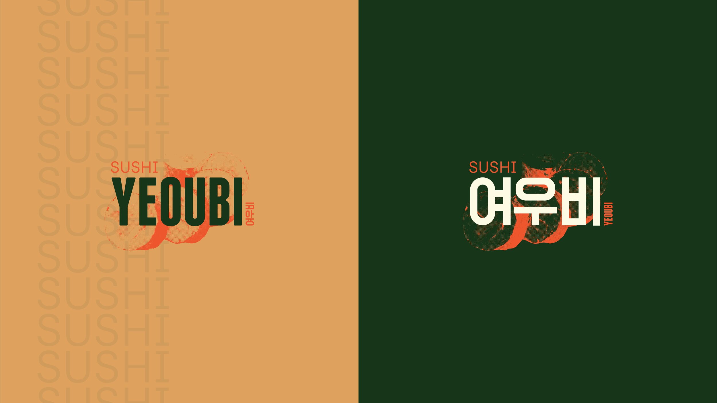
In Korean, Yeoubi means sunshower: the event of having light rain while the sun is shining. The team wanted to combine an Asian aesthetic with a modern on-the-go-inspired design to create Sushi Yeoubi. Because their restaurant was inspired by their Korean ties, they wanted the logo to pull inspiration from a dojang stamp. The similarities between the texture of a sushi roll and a dojang stamp made the perfect design elements for this brand design.
While utilizing brand assets both in English and Korean languages, Sushi Yeoubi stands out from other competition by creating an enveloping experience from the very first touchpoint with their customers.
Yeoubi prioritized brand from the very beginning and launched with a successful start.
Check out their brand in action at @sushiyeoubi.


